

How to Build Cumulative Probability Plots (S-Curves) for Project Risk Comparison

Have you ever had a decision to make, but there were too many unknowns to choose from? Perhaps the decision was which movie to watch on Netflix. Your desired outcome is to choose a movie you will enjoy. The opposite of that is losing two hours of your life to a movie with no redeeming value. How can you weigh the potential of the movies to choose from so that you are more likely to have a good night? Welcome to probability.
Probability measures the likelihood that potential choices will result in the positive outcome you want. The choices you can potentially make end up somewhere on a scale from worst to best outcome. However, when dealing with probability, the answers are never exact points on that scale. Projects must be evaluated under uncertainty and not be done so to choose a single outcome, because that is impossible. Instead, they must be looked at as choosing a distribution of possible outcomes within which the true answer may lie. That distinction is critical. Most traditional analyses collapse uncertainty into a single number, but real decisions live in a range provided by statistical variability.
That is where cumulative probability plots, or S-curves, come in to help solve that problem. They visualize the full range of potential results and make it possible to compare not just value but also allow for risk, confidence, and trade-offs between alternatives. Essentially, providing a tool to quickly and easily view a range of possibilities and their likelihoods.
Understanding What an S-Curve Shows
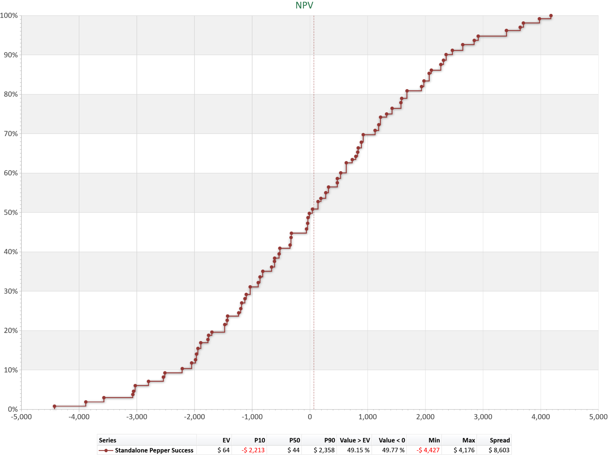
An S-curve is a simple idea with powerful implications. As with most plots, there is an x-axis running horizontally and a y-axis that runs vertically. The x-axis represents the range of possible outcomes of the information being evaluated. The y-axis represents the cumulative probability, with higher values indicating a more probable outcome. As you move from left to right, the curve tells a story. The left-hand side shows downside risk—the worst outcomes and their likelihood. The middle section represents the most probable range of outcomes. The right-hand side captures upside potential.
The shape of the curve matters just as much as its position. A narrow curve signals confidence and predictability. A wide curve indicates uncertainty and risk. This is where S-curves become far more informative than a single expected value.
How These Curves Are Built
To build an S-curve in a probability plot, you first need to identify the range of possible outcomes. Depending on the purpose of the plot, the outcomes can range from the total cost of a project to the total time required for a project’s completion, or a million other potential outcomes of a query. So, understanding what you need to answer with the plot and which parameters are critical to defining the success of that answer is the first step. This can usually be defined by using a decision tree or a Monte Carlo Simulation model. Once that data has been generated, sorting the outcomes in ascending order from lowest to highest value will set the stage for the plot’s parameters. The probabilities are then sorted by outcome and assigned probabilities, setting the waypoints for the S-curve to be generated. The curve always slopes upward because probability accumulates as outcomes improve.
What Makes S-Curves So Useful
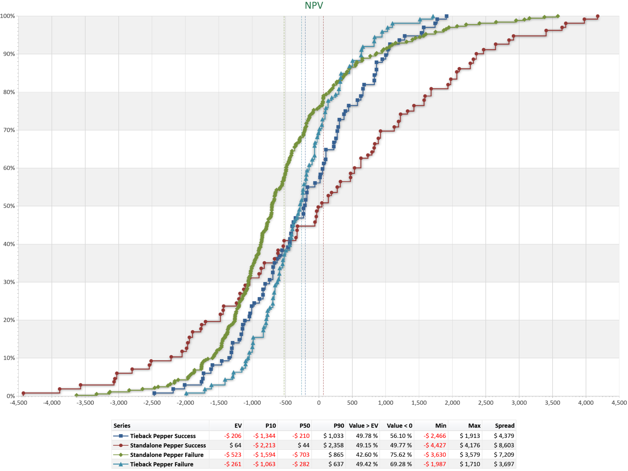
The real power of cumulative probability plots emerges when comparing alternatives. Instead of debating a single number, decision-makers can see how entire distributions stack up against one another. Sometimes one curve sits consistently to the right of another. In those cases, the choice is straightforward—one option dominates. More often, however, the curves cross. That is where the decision becomes interesting. A crossing of curves signals a trade-off. One option may offer higher upside but also greater downside risk. Another may be more conservative, with tighter outcomes but lower potential reward. The right choice depends on whether the organization values stability or opportunity more. This is why S-curves are so effective in decision-making discussions. They don’t give you the answer—they make the trade-offs visible in a quick and effective manner.
Reading Between the Lines
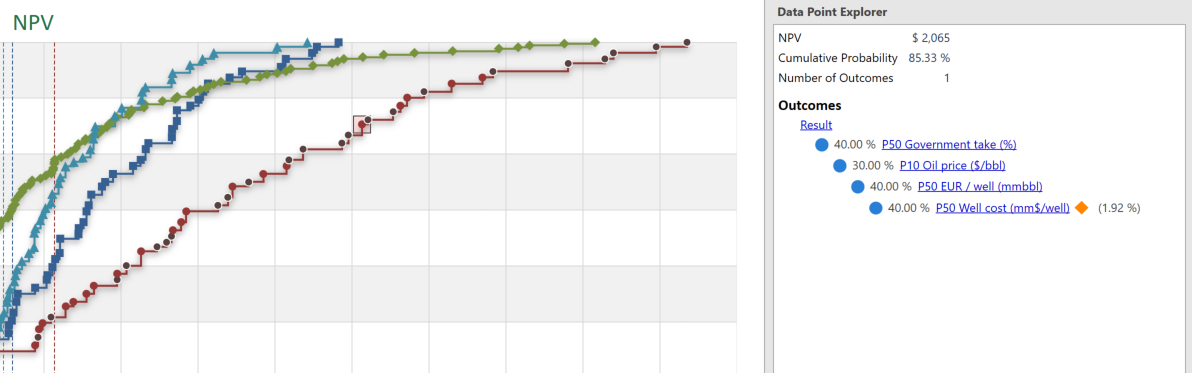
Decision makers should pay close attention to three things: the spread of the curve, the downside exposure, and the upside potential. Together, these define the opportunity's risk profile. Ideally, an S-curve will have a narrow spread, meaning a more definitive outcome can be assessed. A wide spread means the potential outcome is too uncertain, and a follow-up examination may be required to narrow the range of possible outcomes. This is where a TreeTop feature can be used to highlight which branches of the decision tree produced the curve being analyzed. The probability may be reassessed to reduce the risk of decisions made based on the cumulative probability plot.
Bringing It Back to Better Decisions
Cumulative probability plots shift the conversation from certainty to clarity. Instead of asking, “What is the answer?” teams begin asking, “What could happen, and how likely is it?” That shift is where better decisions come from. And in a world where uncertainty is unavoidable, that kind of clarity is a competitive advantage.