

How to Build and Interpret Tornado Diagrams for Sensitivity Analysis
The big picture, when it comes to sensitivity analysis, is usually a lot like the art style known as pointillism. Pointillism uses a series of small dots of varying colors to form the overall picture when viewed from a distance. Up close, it appears like there is no order. Chaos even. But when the viewer steps back, focus is achieved, and the whole picture can be appreciated.

Now imagine those colored dots as data points. Today’s world of digital tracking and data inputs often supplies too many dots. The interpreter cannot make sense of them if looked at individually for their meaning. The analyst needs to take a step back and look from a distance. Understand how each variable in a system impacts the overall picture.
That is where a tornado diagram comes in.
What Is A Tornado Diagram?
A tornado diagram, in technical terms, is a deterministic sensitivity analysis tool that shows how changes in individual variables impact a key outcome. They identify the key uncertainties that significantly affect the metric being measured and offer the potential to simplify the probabilistic analysis by incorporating only the driving uncertainties. Those variables may be anything, from shipping costs to production timing, and an infinite number of other potential factors in a system’s performance. In more colorful terms, a tornado diagram allows the analyst to step back from the close-up view of tiny data points and see the whole picture. This makes it easier to identify, evaluate, and closely scrutinize the most impactful variables. A tornado diagram helps the viewer understand which uncertainties in a complex system actually matter, and which items are simply dots.
Building the Tornado Diagram
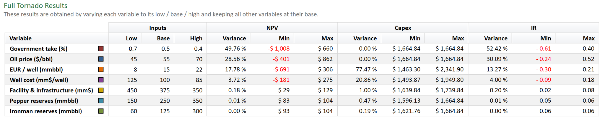
To successfully build a tornado diagram, one first needs to identify which uncertainties may have the most significant impact on a system's performance, thereby defining one's model. For economic models, inputs such as cost, production timing, and market fluctuations typically matter most. Once the model is defined, select the key uncertainties, especially variables that plausibly impact the outcome. Teams are often tasked with considering a lot of uncertainties at first, but filtering down to the key ones by the time they are using a tornado. Perhaps it should be reiterated that the teams of course do the above before creating tornados so it does not come across that we are being too narrow minded. Only after key uncertainties have been evaluated and pinpointed, should additional uncertainties be put in for comparison’s sake. For a fair comparison, consistent ranges need to be standardized with a median or base range, then a low case with the most negative impact, and a high case with the most positive impact.
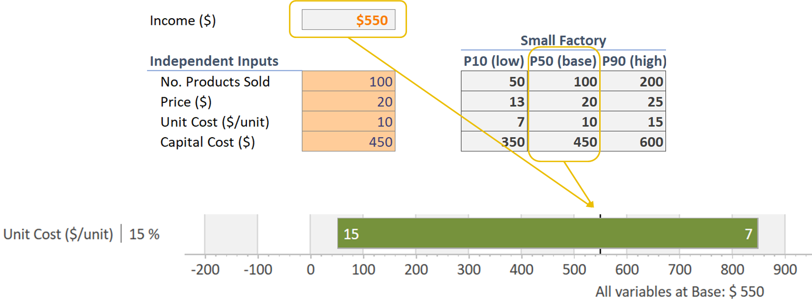
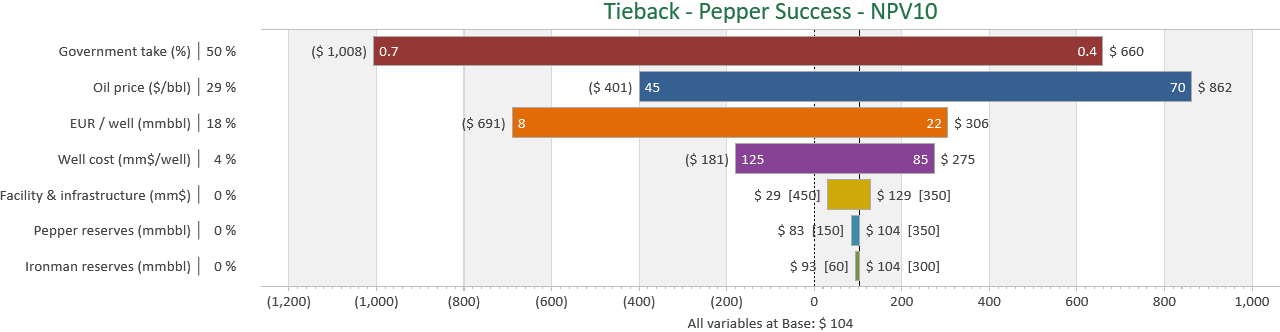
As you move through the model, adjusting variable by variable, you will be able to calculate an impact range used to determine the bar length for each variable. Based on your system’s key goals, the x-axis value range will be determined. The y-axis will then consist of the varying inputs tested for impact, with the items with the highest impact at the top of the ranked bar chart, descending to shorter bars for lower impact.
Interpreting Tornado Diagrams
The top drivers of uncertainty will be at the top of the ranked bar graph, funnel-like structure. This will provide a quick view of the most impactful variables affecting your system’s outcome and help you determine which areas may require additional scrutiny or backup in the event of a worst-case scenario. However, the tornado diagram does more than just show your vulnerabilities. A thoughtful review can also help the analyst understand whether the potential range of outcomes is linear or asymmetric, and identify control points for leverage. The tornado graph can show both strengths and weaknesses, and due consideration should be given to potential defensive stances to adopt or offensive strategies to employ to maximize the positives.
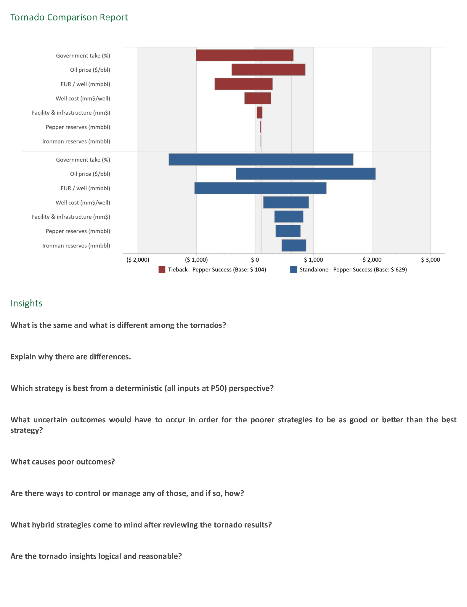
The tornado graph is a valuable tool for refining one’s vision of a complex environment. They can be used for budget planning, managing project schedules, identifying key risks to a project's desired outcome, and optimizing resource use, among many other uses. A tornado diagram is not just a chart; it’s a decision-making tool that helps cut through complexity and focus on what matters in a project or business. Most importantly, it provides a quick analytical tool for decision-making that can quickly make sense of uncertainties, how they may affect the project, and how initiated changes from their evaluation may impact the bigger picture, transforming individual data points into the art of complex analysis.